Or why you should test new glazes before putting them into production…
It’s important to test new glazes to make sure that they ‘fit’ the clay that you use. A bad ‘fit’ (meaning that the glaze and the clay body have different coefficients of thermal expansion) can create problems like:
-
The glaze will craze. This can be attractive, but it means that the glaze is not food safe as bacteria can get into the cracks and will be unsanitary
-
The pot will crack. Severe fit issues can actually destroy your work. This is called ‘dunting’ and it’s very dangerous, as it doesn’t necessarily happen right away. Imagine your customer holding a mug say, and it suddenly explodes in their hand, or the first time they try to make tea…. terrifying!
-
Sometimes the glaze can just flake right off - this is called ‘shivering’ and is obviously really dangerous when selling your work.
-
If the glaze doesn’t adhere properly to the pot it can leave bare patches in the firing, this is called ‘crawling’. It’s not dangerous on stoneware clay fired to the appropriate temperature, but it’s not very attractive.
I wanted a nice turquoise glaze, a pale pink, a pale blue, an orange and a pale grey, so off I went, created my glazes, measured out all the ingredients in small test amounts and mixed them up. Then I created test tiles with little dishes underneath (just in case the glazes run, to protect my kiln shelves) in each of my commonly used clay bodies, and bisque fired them to 1046 degrees in my little electric kiln.
After applying the glazes and labelling them, I fired them to 1220 degrees and the results have just come out of the kiln:
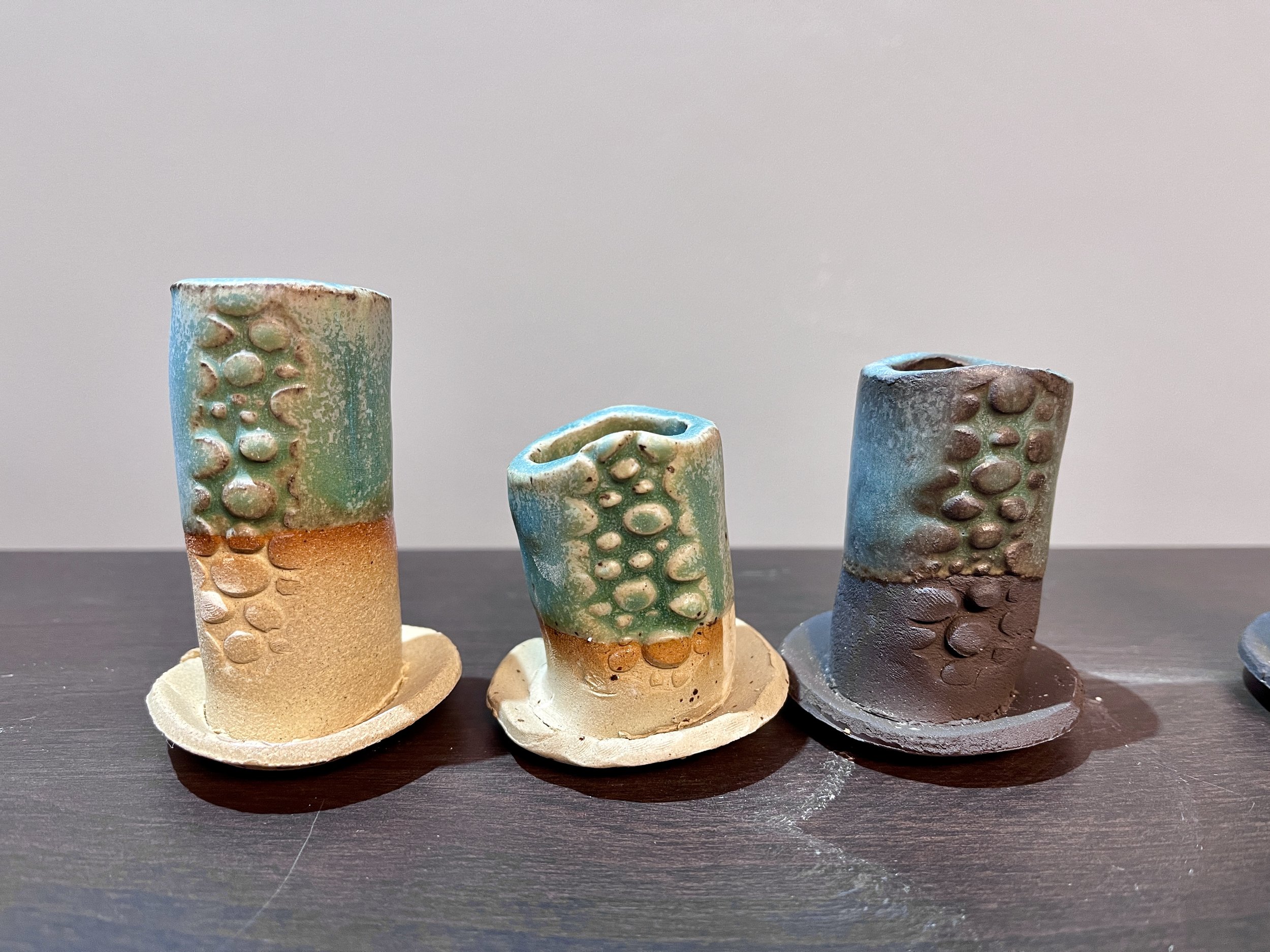
Turquoise test tiles
This is the turquoise glaze. See how different it looks on three different clays? This one is beautiful but at the moment not suitable for dinnerware as the surface is too ‘soft’ - it will mark too easily with cutlery, so I’ll be trying to reformulate it to make it more hard-wearing.
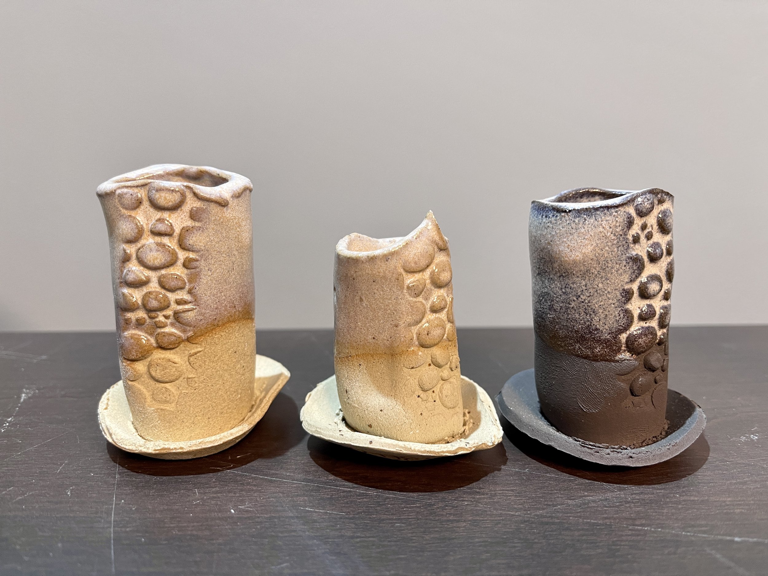
Pink-ish test tiles
I’m not sure how well it comes across in the photo, but it’s a really nice pale speckled pink. It’s particularly pretty on the black clay, though I think it needed to be a bit thicker.
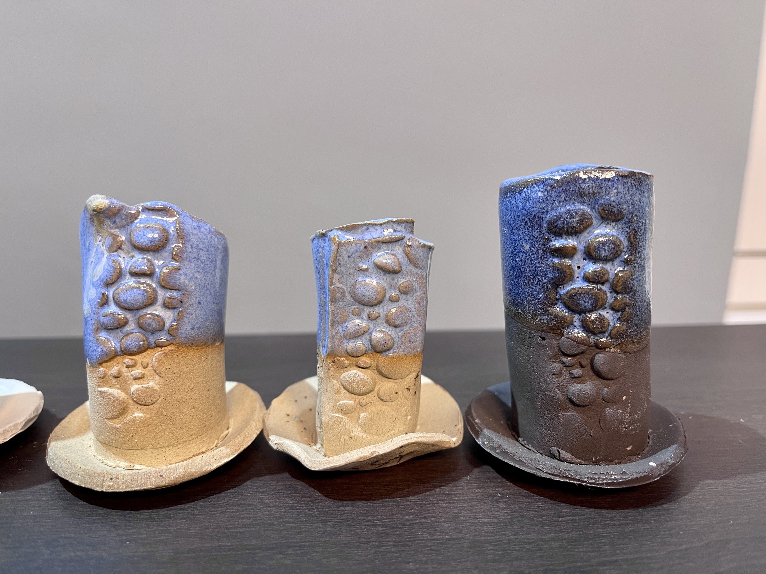
Here’s the pale blue. It’s actually a little bit too blue for my liking, so next time I’ll decrease the amount of Cobalt Carbonate in the recipe, as that’s what makes it blue. Again, really nice on the dark clay.
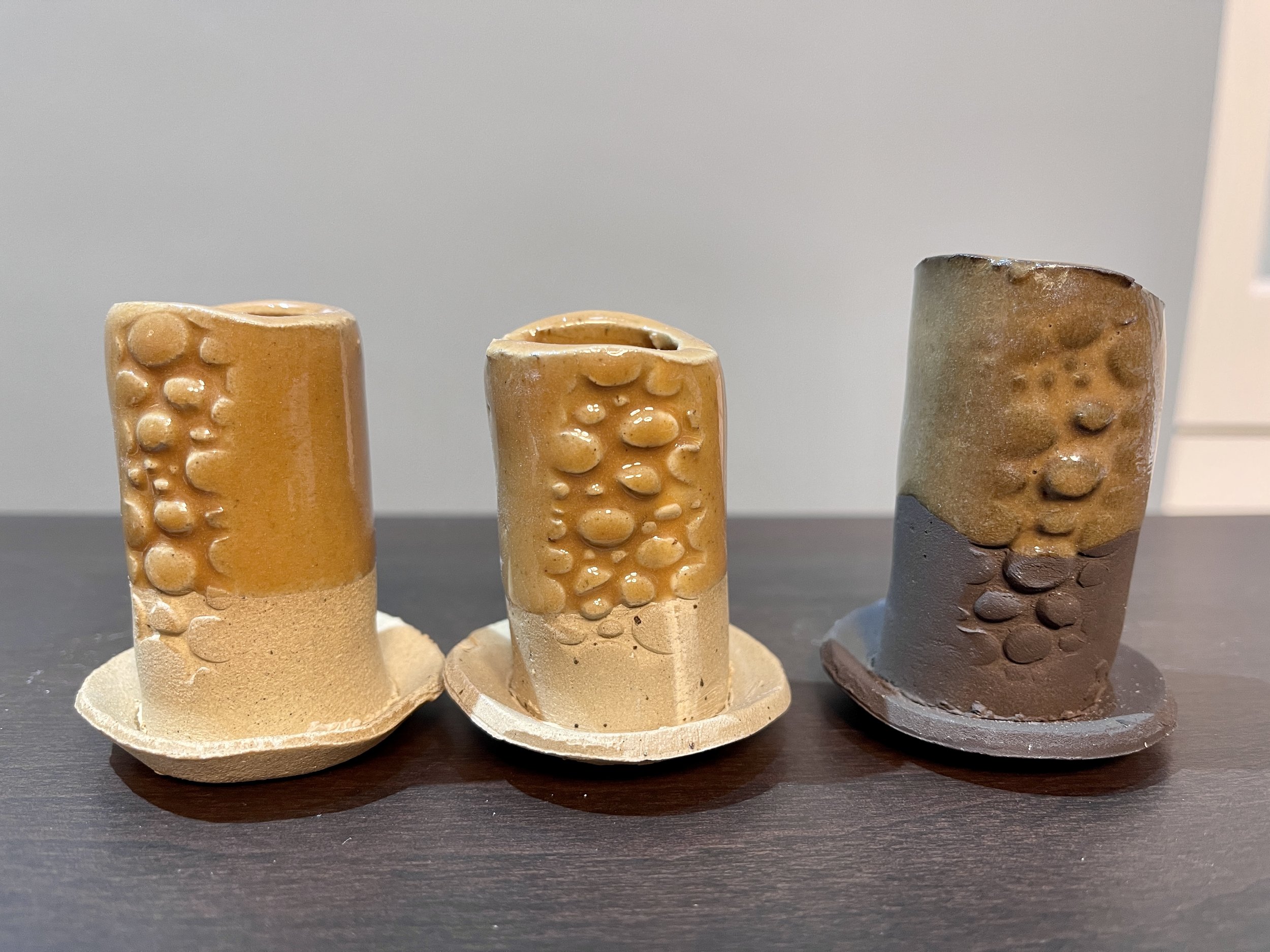
Tangerine test tiles
This is the orange test. My husband hates these - says the one on dark clay looks like poo! I can see where he’s coming from, but the actual glaze quality is great, really glossy and a good coverage, and I don’t hate the colour either!
Grey test tiles
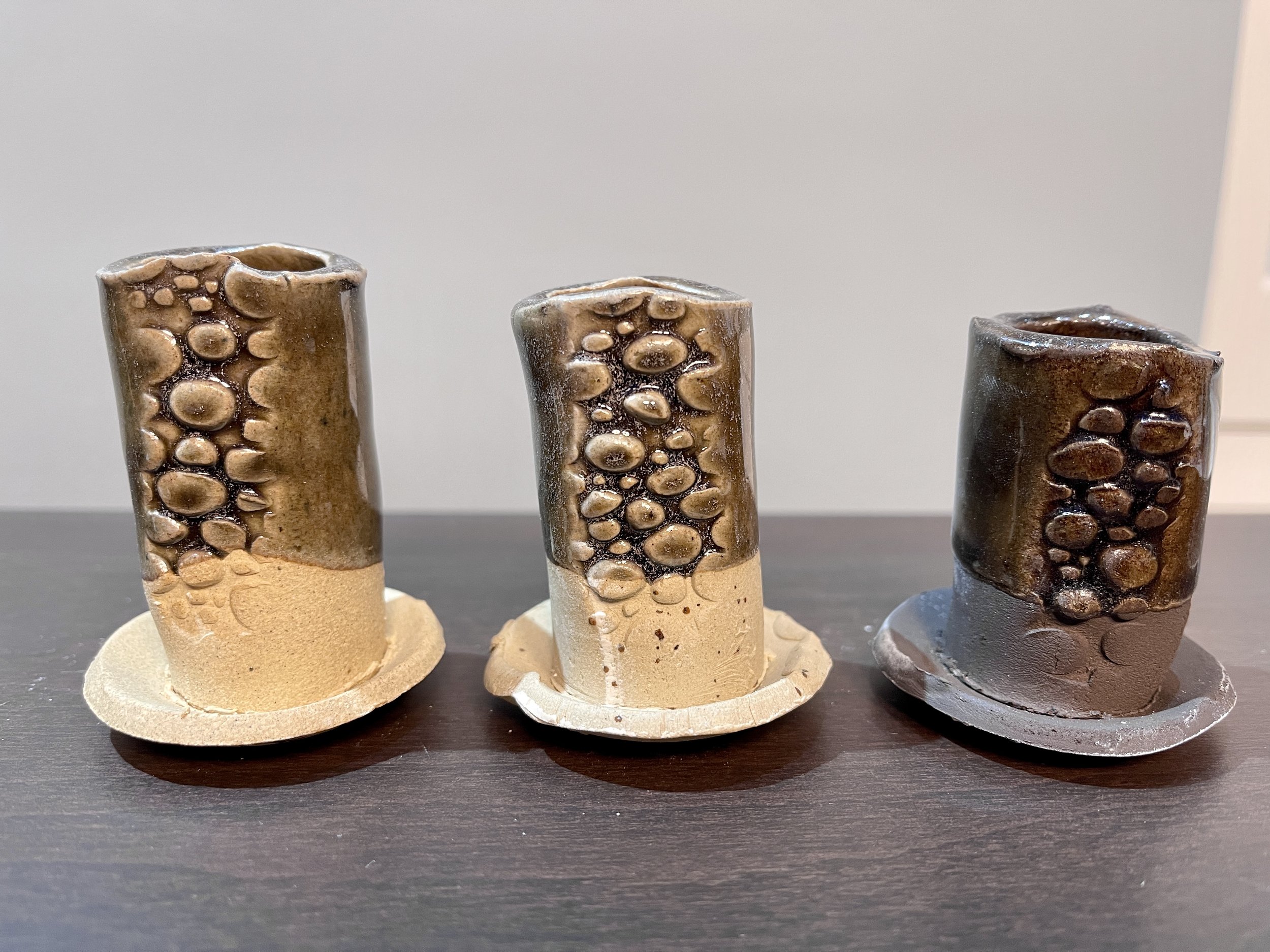
These are supposed to be the grey test tiles. This one needs a bit more adjustment, as whilst it is an attractive glaze (I love the little white speckles you can see in the thicker bits), I was looking for a bit more opacity. So that means I’ll need to adjust the whole recipe to add more opacifier, which is not as simple as it sounds as the other ingredients will have to be balanced to keep the chemistry the same.
Overall I think those are a great set of results! My next step is to subject the test tiles to extremes of temperature and make sure that there are no problems like the ones I have detailed above. I will also acid test them to make sure that none of the glazes will leach any ingredients into food, or lose colour in a dishwasher.